I remember exactly ten years ago when I would install Nova Launcher and the Moonshine icon pack on my beat up, life-supported Samsung tablet when I disliked what was then TouchWiz. Ten year old me felt refreshed in comparison to the really clunky look of the old Samsung skin that came with that tablet.
I loved Material Design so much I would even dare to root my tablet or even flash a custom ROM, if only I had a PC. My older brother had to put a stop on me because not too long, he bricked his Samsung Galaxy Y for flashing too many custom ROMs on it.
But those days were long gone. He uses an iPhone now and gone was the fresh and vibrant papery look and feel of Material 1.0 and the stale approach of Material 2.0. We're now on the funky shapes, colourful, but monotonous era of Material 3.0 (or Material 3 Expressive in it's most recent incarnation).
People Look Back on Aero or Aqua, But MD1 Was My Dearest
I see people today, appreciating the glossy and shiny effects that Windows Aero or Apple's Aqua and the Skeuomorphism phase of the mid 2000s had been known for. Yes it's pleasant, it's not flat and boring — but the original incarnation of Material Design was like the best of both worlds, plus with a motion system that had great potential, I was in awe with the design system.
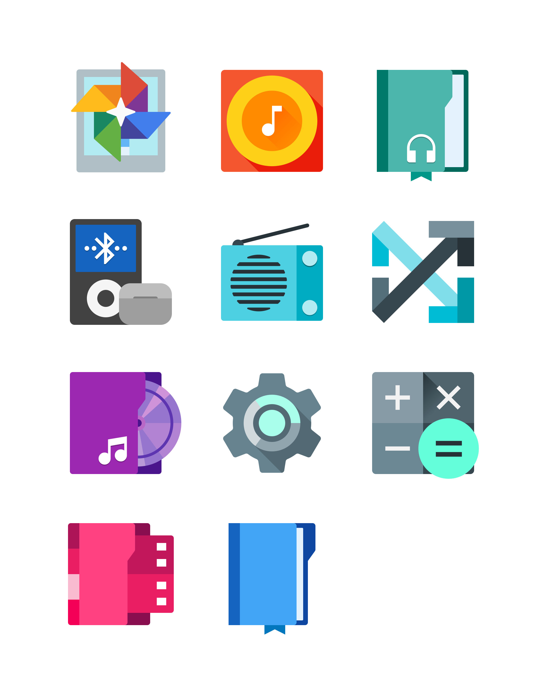
One big aspect of Material Design 1.0 for me was the icons, they were gorgeous, even on screens that looked complete dog-water. They were sharp, flat but not boring, and way more vibrant. Unlike whatever dumb slop Google is doing with their current icons today.
Now, it wasn't perfect. The implementation was mostly not even up to the mockups they've shown on the internet, especially that music player concept they had, or the not so pleasant color combinations that plagued a lot of apps using this iteration.
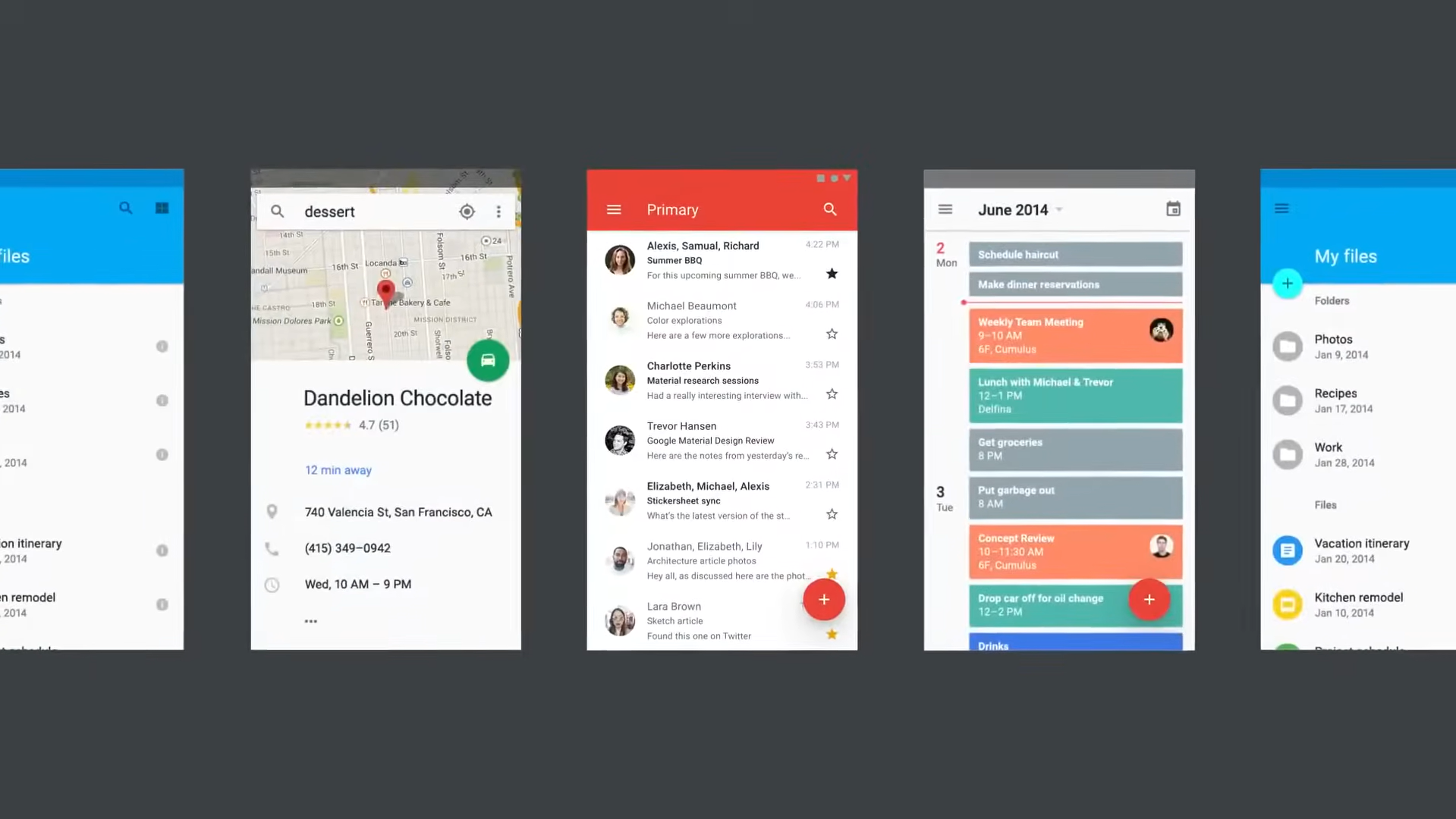
The Lameness of Material Design 2.0
By 2018, with the release of Material Design 2.0 it went on to heavily clean up some of the flaws its first iteration had but ripped out what made it so innovative. Applications had a breadth of fresh air, it felt more spacious, with entire applications going fully white, and colours being reserved for accents like buttons. But it was kind of dull, there was barely any colour aside from the + icon on some Google apps, it just felt too sterilised.
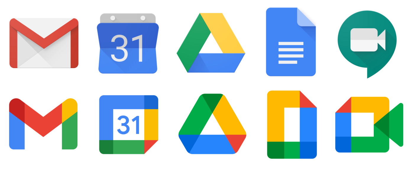
And don't even get me started on the absolute sin that has been committed to many Google App icons since 2020. Seriously, Google? Why? What is this?!
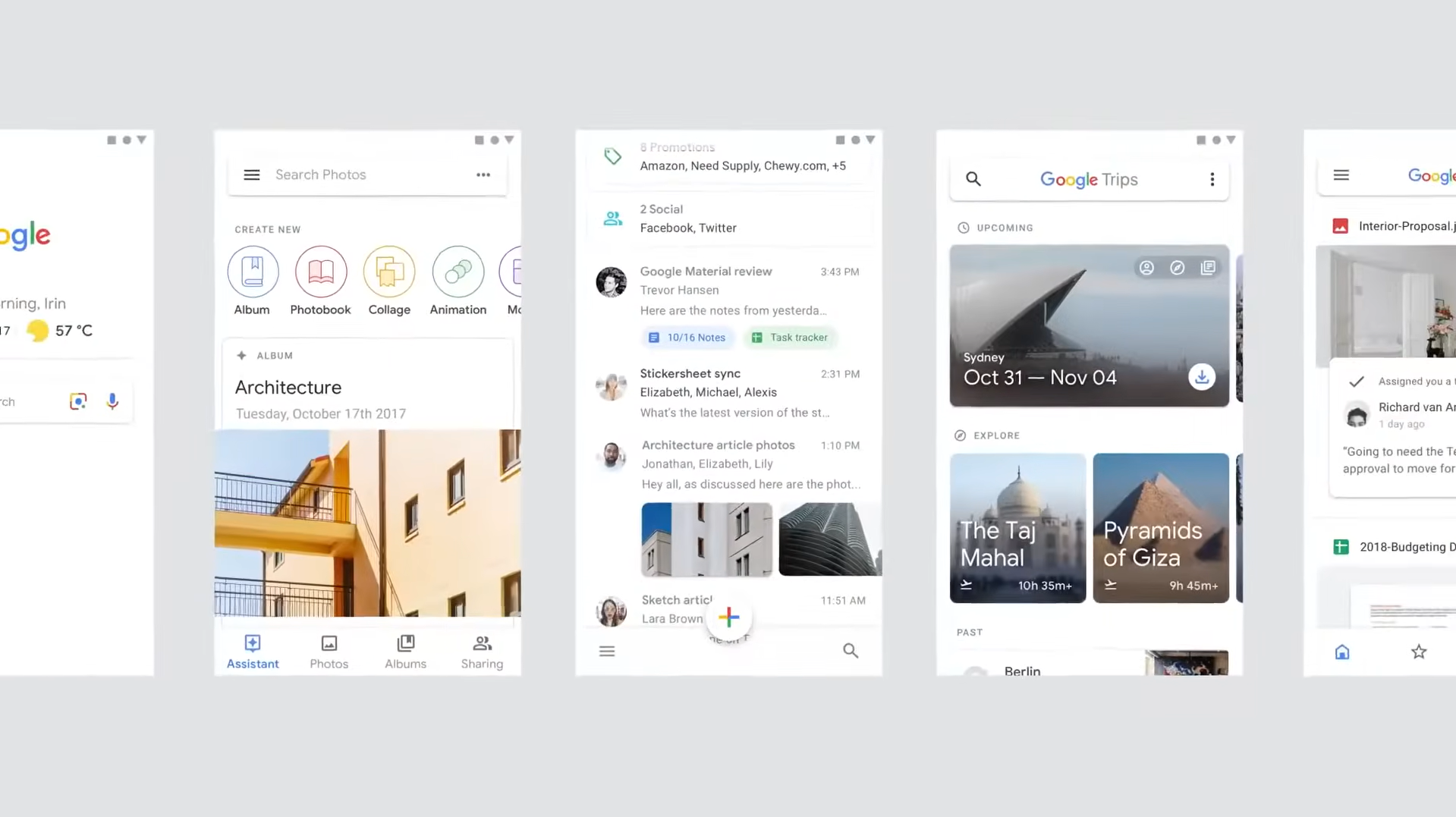
Material You Felt So New it Faded My Nostalgia for MD1
I remember the marketing with Material You (Material Design 3) and the Google Pixel 6 series. It made me really excited despite knowing I won't get to experience Pixel or stock Android on any of my devices, while it was amazing, the implementation from various OEM providers were pretty meh, devices from Infinix and sister brands didn't even support it until Android 14, my phone was stuck on Android 11, and Samsung's implementation was meh.
But three years ago I was toying around with custom ROMs and managed to flash an unofficial GSI of LineageOS 19.1 on my Galaxy A20s. I don't think LineageOS is a very faithful experience of whatever Google is doing for Android but giving it a taste, it was amazing!
The idea of implementing colors throughout the UI based on the wallpaper was an oddly mind-blowing idea, and I think Google implemented it very well when they redesigned Android's UI components for Android 12, best case of it being implemented in my opinion was the lock screen. But four years after the implementation of Material You, things began to feel stale once again.
Hello, Material 3 Expressive!
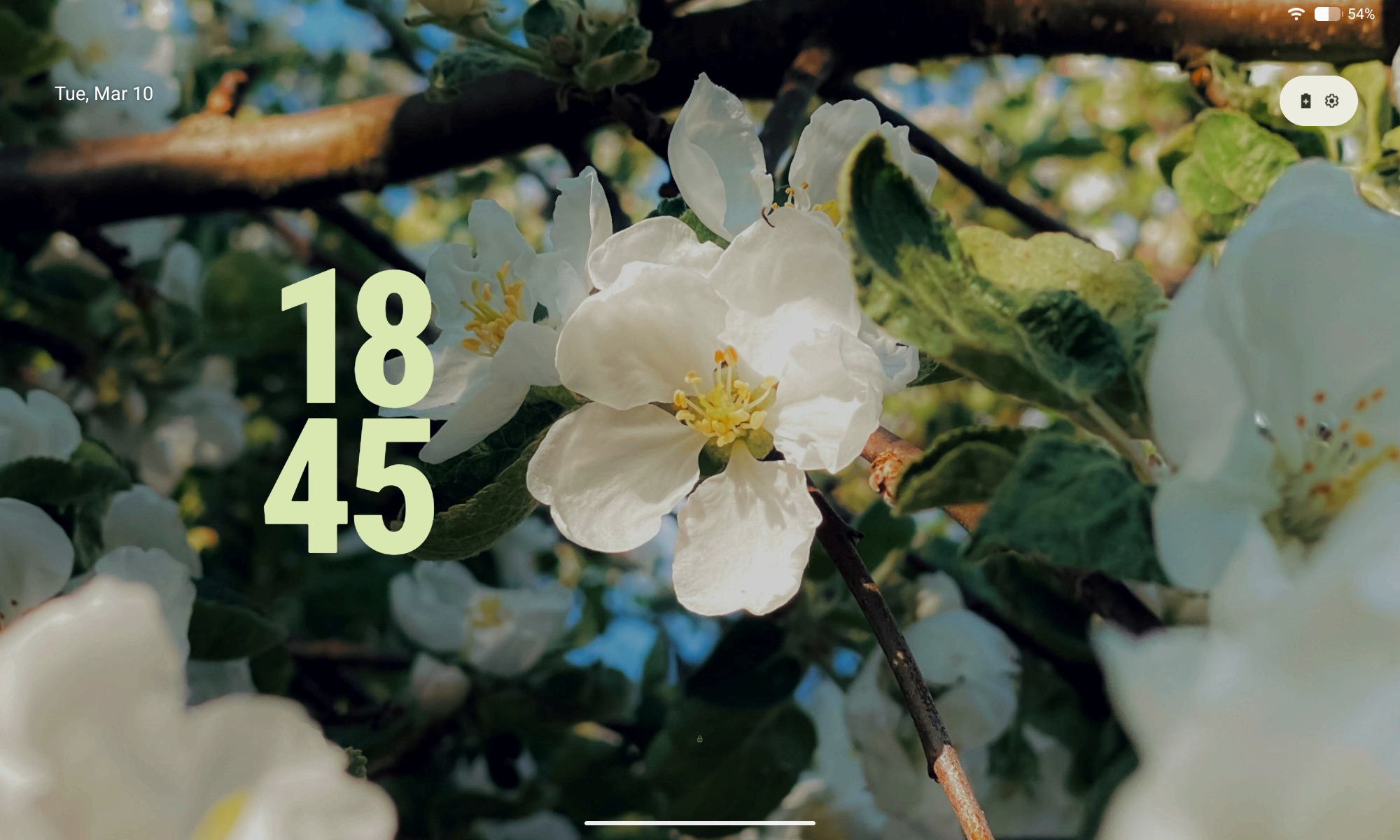
Material 3 Expressive is simply just an extension of Material You. But this one felt daringly ambitious, colors are more vibrant, shapes are more prominent, and motion physics that felt playfully fun.
I still yet to experience most of it, heck, I'm getting myself a small taste for it with LineageOS 23 but on my Samsung Tab S6 Lite (2020), so I essentially went full circle here!
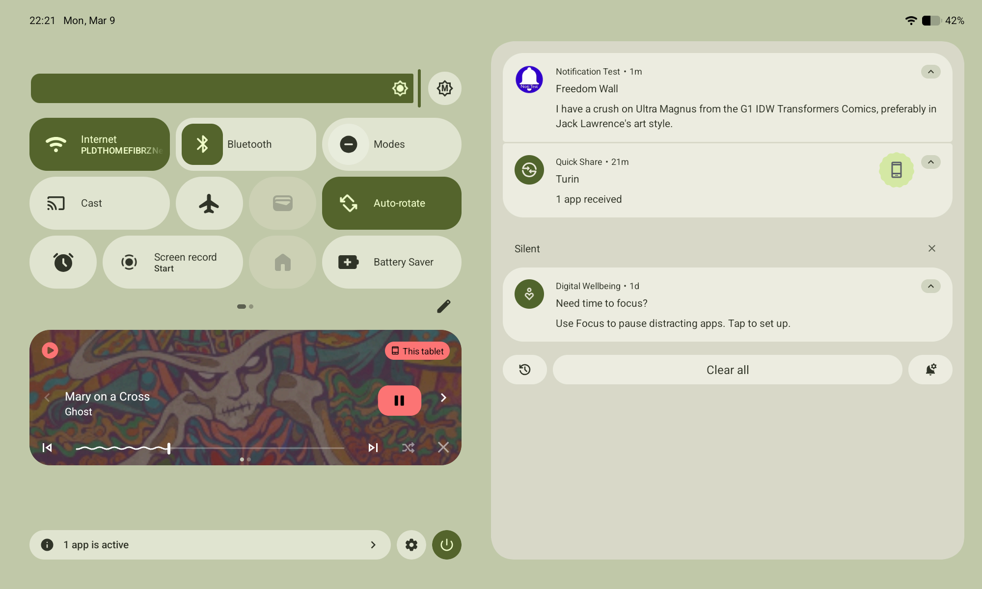
Oddly enough, the notification panel in Android 16 is in my opinion the best implementation of Material 3 Expressive here, bouncy buttons, physics, and controls.
![]()
![]()
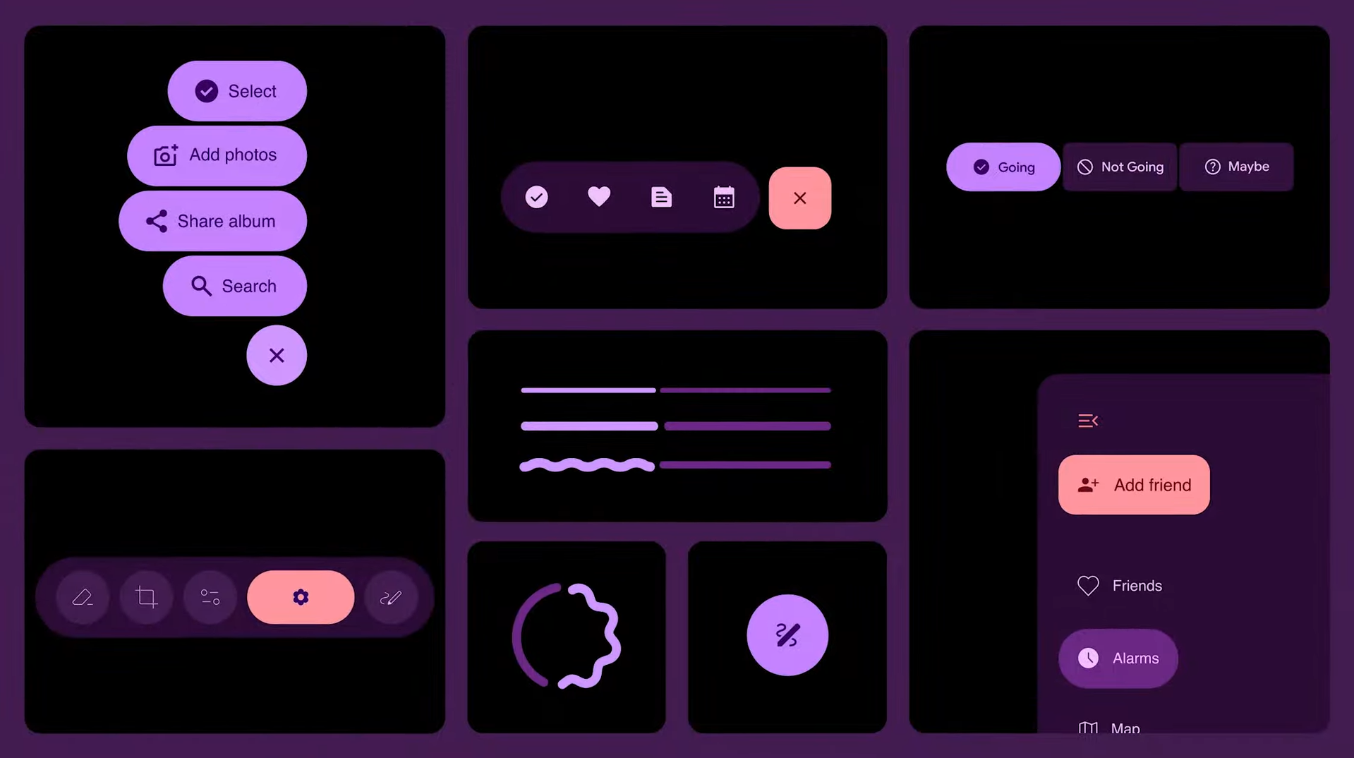
As for apps taking advantage of this iteration of the design language, so far an open source local music player called PixelPlayer takes the cake, even if it kind of gets overboard in some places (in my opinion). I recommend giving it a try, you can get it on their Github page here. Theovilardo and project contributors does an amazing job with the project, it's difficult to ignore their hard work.
As to Why I've Been Fanboyish of Material
While Microsoft's Metro Design Language was the one that premiered flat design and typographic emphasis with the Zune HD and Windows Phone at the mainstream. The original iteration of Material Design was honestly the best and it continues to improve with later versions to this day, it never felt sterile, even became more widespread and dominated the web for much of the 2010s.
The design language made me dive into UI/UX design exactly ten years ago, making mockups on PixelLab or drawing them on paper because I didn't have a computer. Without getting into that realm, I wouldn't be a graphic designer, a web designer, heck, you probably won't even come across my Neocities or this blog-post without it. It felt like I owe a lot to the people behind who made this design language possible for leading me to this in the first place.
To Matías Duarte and the team behind Material Design, you guys absolutely rock and I couldn't express into words how much I thank you, and how you've inspired me to take on this role as a UI and UX designer.